Park UX/UI
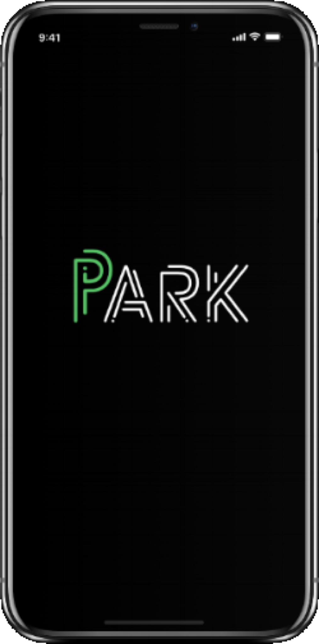
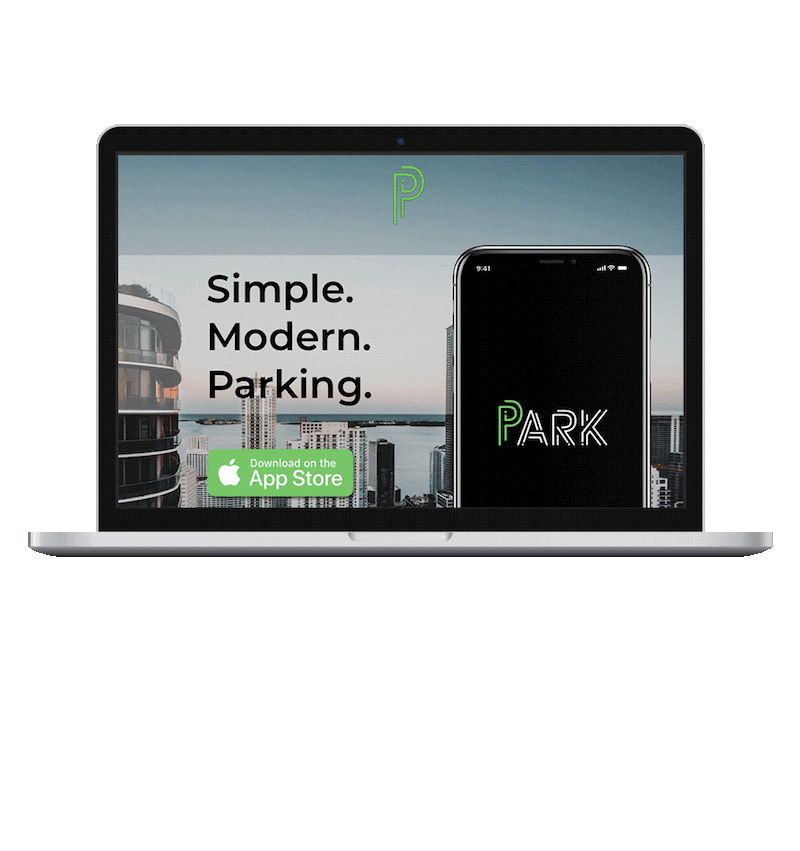
PARK UX/UI
Simple. Modern. Parking.
UX/UI Design, iOS + Web
Watch my PARK presentation at Hackshow Miami:

The Client
If you've ever parked in Miami, this one is for you. Otherwise, the Miami Parking Authority (officially known as the Department of Off-Street Parking of the City of Miami) is an accredited parking organization with the goal of meeting the community's parking needs and continuously striving for business excellence. The Miami Parking Authority envisions being the hub of all things parking in South Florida while simultaneously bettering Miami, Miamians, and all of the transplants that move here for sunny skies, rainy summers, empanadas, and cafecito (and so many other things but, I digress).
The Challenge
Did you know that in 2008, Miami became the first major U.S. city to start accepting mobile payments for parking? The Miami Parking Authority was a catalyst for transitioning the parking experience from meter to mobile.
Although Miami-Dade County helped catapult a shift from traditional to digital payment, there are some challenges when it comes to mobile payment parking apps. There are several mobile payment parking apps in Miami and greater South Florida, and multiple municipalities that should work together but currently do not. PayByPhone dominates the MPP app industry in Miami, but it is not the only app (ParkMobile is another popular one in Miami, for example).
Within the MPP apps, there are pain points that can be addressed. Initially, I chose to create a parking app because of my own pain point when it comes to mobile payments parking (MPP) apps: because multiple municipalities use different apps, I found myself consistently having to download new apps just to park! Meanwhile, I have Sprint - so my cell service only works when it wants to (I’m hoping for a miracle now that they merged with T-Mobile), and more often than not, my experience using mobile parking payment apps was unpleasant.
Conducting Research
Qualitative Research Insights
I couldn’t base the Park app solely off of my own experiences, so I had to do some qualitative and quantitative research to really understand MPP app users’ current habits, pain points, motivations, and goals.
Before I began the research, I created a lean survey canvas and lean UX canvas. The lean survey canvas helped me decide on survey questions to ask, and the lean UX canvas aided in identifying and analyzing the big picture on both the user and business end.

Lean UX Canvas
I had to define business metrics that would help me understand Park's success. These metrics included increased customer acquisition and retention, positive reviews, and the Miami Parking Authority approving and implementing the Park application.
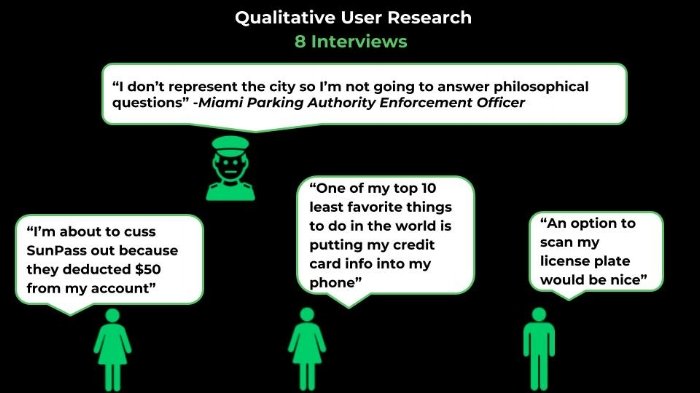
After understanding the client, challenge, and business, I was able to conduct research. Based on 162 survey responses and 8 interviews, I found that 70% of respondents use parking apps to pay for parking, and 50% of them say it takes 2-5 minutes to complete the entire process – which is a long time in our current digital world.
I found a chance to interrupt a Miami Dade Parking Enforcement officer during his shift and asked him some questions. His most valuable feedback was “I don’t represent the city so I’m not going to answer philosophical questions” (I get it man – just doing your job. No hard feelings.)
Research Analysis + Insights
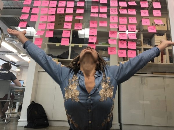
Affinity Mapping (very excited)
To analyze the research, I created an affinity map using a ridiculous amount of post it notes. I came up with these main insights:
Mobile payment parking apps are convenient
Onboarding takes too long
People don’t like downloading multiple parking payment apps
Most think the apps are outdated and can be modernized
I know post it notes are a staple in a UX Designer's diet but I feel environmentally unfriendly using this much paper (then I found out about Miro and my existential thoughts about post it notes and my career subsided)
Based on my main insights, I was able to come up with my How Might We statement:
How might we modernize mobile parking payment apps to speed up the process for users while providing partnership opportunities between multiple municipalities?
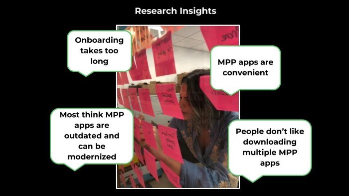
Main research insights from Affinity Map
The Users
Fun fact: there are more female drivers, but males drive more. This research plus the qualitative and quantitative research I conducted helped me identify my user persona: Parking Pam.
Parking Pam is an essential part of UX design. Design thinking runs the entire process, and the first step is empathy. She represents my target audience, and allows me to better empathize with my user.
What you need to know about Parking Pam: She is a 28 year old, single millennial living in Miami, working as a real estate agent and is also part time student. She is doing very well in real estate but she hates working on weekends and wants a job that interests her more. She has to drive constantly to meet her clients, and often needs to pay for street parking using mobile parking payment apps.

User persona
After identifying my user persona, I was able to create a user journey. As we know, Parking Pam is a busy real estate agent who is skilled at putting miles on her car. Pam is doing well financially and just got a new car - she is trading her Prius to a Porsche Panamera (you go, Pam)! She showed up to meet a client and had to update her vehicle information in the MPP app she was using, which made her late to her appointment! She was frustrated and wished there was a quicker, more modern way to update her car information.

User journey
Based on Pam’s journey, I was able to ideate and brainstorm possible solutions, which then lead to creating the happy path for the Park iOS application.
The Real MVP
Parking Pam and her journey were defined, and I was able to empathize with her. Based on the pain points and opportunities identified in her user journey, I was able to move on to the research analysis step: the MOSCOW Prioritization, which helped me identify my minimum viable product (MVP). MOSCOW defined my must have, should have, could have, and won't have features.
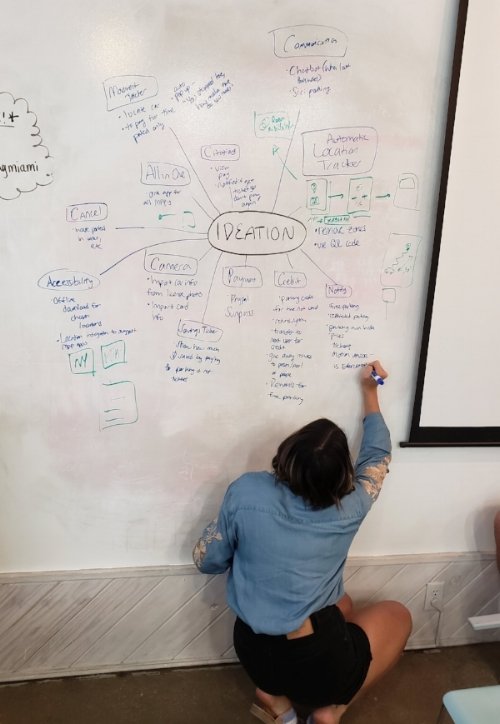
Ideation to create MOSCOW
My MVP turned out to be modernization. Park would become the most modern mobile parking payment apps by including specific features: automatic location zone population using GPS, license plate photo capture, SunPass detection and payment, and a Siri option.
Information Architecture
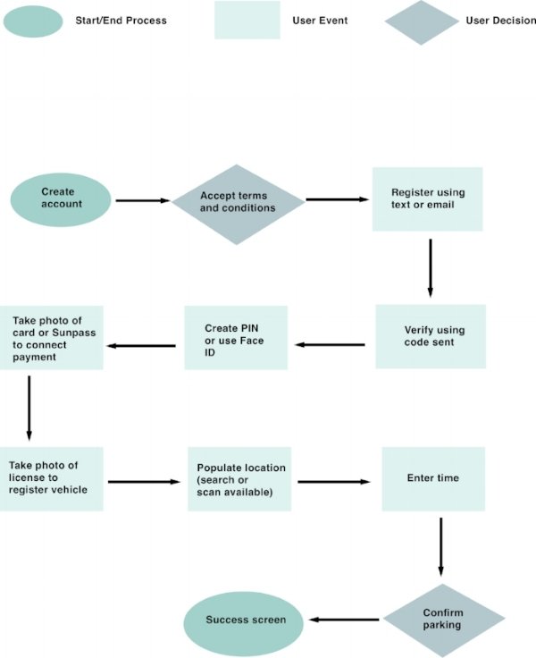
Now that I understood what it would take for Pam to have an exceptional experience using a mobile payment parking app, I began to plan out the user flow based on her happy path. The user flow consists of starting and ending processes, user events, and user decisions. In layman's terms, the user flow maps out every step Pam would take to achieve her goals from the moment she begins using the app to the moment she completes her tasks. After creating the initial prototypes, I had to reiterate the user flow to represent the valuable feedback from testers.
User flow - happy path
Creating a site map was the next step. I had to logically decide where information was going to be located on the app. I received feedback from colleagues and conducted card sorting to better understand users' mental models, and apply what made sense to them.

Site map
Prototypes
After a few rounds of trial and error, the information architecture made sense, and I was ready to start bringing the Park app to life (cue air horns and clapping)!
I started out with paper and pencil concept sketches utilizing rapid design prototyping and conceptual brainstorming techniques like crazy 8’s. After some testing and iteration, these concept sketches turned into my initial low fidelity prototype that helped me visualize the Park app and better understand the information architecture identified from my user flow and site map.
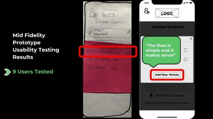
According to the Nielsen Norman Group, only 5 users need to be tested for usability because nearly all usability issues are found after testing just 5 people. So, after testing the low fidelity usability with 5 testers and through heuristic evaluation, I found that I needed to move the “Add Vehicle” button to make it more noticeable and in the thumb zone. Also, 60% of testers asked if there was an option to upload a photo of their license or add the information manually. Additional main takeaways included adding a verification step to the license capture and SunPass recognition features, integrating the Siri option better, and removing steps that were not part of the current happy path.
Changes made on Mid Fi based on Low Fi usability testing feedback (1)
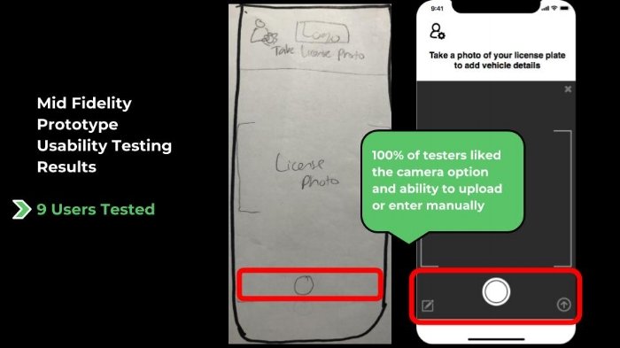
Changes made on Mid Fi based on Low Fi usability testing feedback (2)
After making the necessary changes and completing mid fidelity usability tests, 100% of testers liked the license capture feature using the camera, and the option to upload a picture or manually enter the information. Testers also said the flow was simple and made sense. Thanks to iterations and valuable feedback (all hail agile methodology), I felt confident moving on to the UI process!
UI Process
To start the UI process, I did a visual analysis of the competition to see what color palettes, typography, and tone they used, as well as understand the look and feel of the apps. I then decided on possible brand attributes that represented how I wanted Park to feel, before creating a moodboard that emulated those adjectives. After completing 5 desirability tests on the moodboard and getting positive feedback that matched the adjectives I chose to describe Park, I decided on the final brand attributes: simple, useful, and modern.
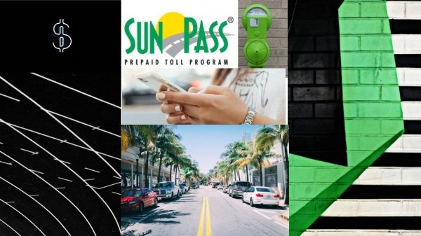
Moodboard
Creating a style tile that included the Park logo, color palette, active and inactive buttons, typography, textures, and photos representing the intended look and feel was next in the process. Desirability tests resulted in suggestions to change the logo, and my favorite quote: “I likey, it’s rectilinear" (not going to lie, I had to look up rectilinear). Fortunately, 100% of testers liked the colors, saying they were modern and fresh.
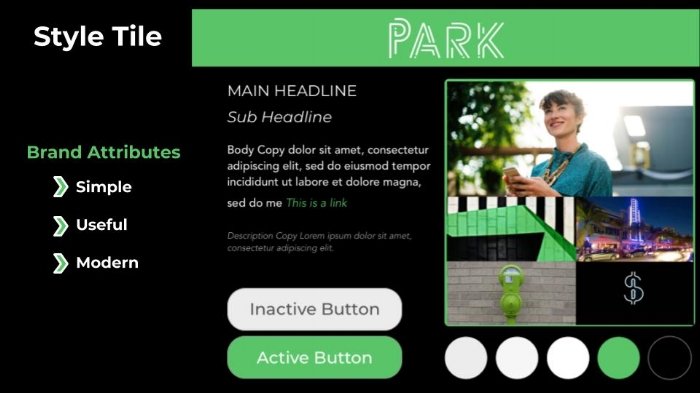
Style tile
Finally, the moment we’ve been waiting for…creating the hi fidelity (hi fi) prototype! I used Sketch to create the visuals, and then uploaded the prototype to InVision using the Craft plugin for Sketch. I was able to create microinteractions in Flinto, an animation tool. Once the hi fidelity prototype was completed, I created a web landing page that matched the look and feel of the app.
As I created the hi fidelity prototype, I made an atomic design document identifying the icons, buttons, elements, and symbols I used throughout the process. Creating my style guide was easy because of this! I added icons, buttons, typography, symbols, the color palette, and the Park logo to my style guide which establishes the guidelines of the Park MPP app.

Style guide
After completing some usability testing on my hi fi prototype, I realized Park didn’t pass the squint test 100% of the time - people had trouble reading some of the text due to font size, background photos, and color choices. That meant another iteration was upon me – I added overlays on screens that were difficult to read. I also changed some icons and buttons that were recurring problems when I tested the hi fi.

High Fidelity screens
Overall, 100% of testers loved having the Siri option to speak their parking duration instead of manually enter it, and also loved having the license capture and SunPass integration. They said it was modern and would save them time – which was my goal from the start, making the process more efficient and effective for users, while disrupting the current mobile parking payment app industry. I’ll always #DoItForTheUser!
Next Steps
There are still many things I want to complete with Park. I plan on building out additional happy paths as well as unhappy paths and error screens, adding additional features such as a transfer payment option as well as a find and pay citation option. I also need to edit the SunPass recognition feature so additional SunPass information can be entered, incase someone else's SunPass is recognized. I also plan on submitting Park to the City of Tomorrow Challenge. Additionally, I want to pitch the app to Miami Parking Authority and SunPass.
Conclusion
Overall, Park provides innovative solutions to an ordinary task, and modernized a mundane and time consuming process. Although it is innovative, it still matches the user’s mental model which is of extreme importance! I'm proud to say that Park won Crowd Favorite at Ironhack's graduation for the summer 2018 full time cohorts (UX/UI and Web Dev)!
Trusting the process and not rushing the process is a key to success in UX/UI design, as well as always being curious and listening to what your users really need.