ABC Fresh
ABC Fresh
Gourmet On The Go!

The Client
ABC Grocery is a leading regional supermarket that provides innovative and personal in-store experiences, fresh meals, and premium products. They have an established network of brick and mortar grocery stores conveniently located to service their client base, which exceeds 30% market share in the region.
The Team
The UX Squad’s members were Kellyn Cabeza, Jonathan Stio, Angel Perez, and myself. We each contributed to all steps of the UX and UI process to solve ABC Grocery’s business problem by creating an iPhone app for busy, tech-savvy millennials in a 2 week design sprint period.
To complete the UX process, we used an incredible amount of post it notes, too many Sharpies, and a plethora of white boards (at one point we mixed up the dry erase markers with Sharpies but we won’t get into that...)
Throughout the design process, we used:
Marvel to create working low fidelity prototypes
Sketch to design mid fidelity and hi fidelity screens
InVision to create usable mid fidelity and high fidelity prototypes with transitions
Flinto to create microinteractions and animations
RealTimeBoard to digitize our UX documents
Essential UX companions: Lean UX Canvas, Lean Survey Canvas, Affinity Map, Market Positioning chart, Competitive & Features Analysis, SWOT Analysis, User Persona, Empathy Map, Storyboard, User Journey, MOSCOW Prioritization, User Flow, Site Map, Card Sorting, Brainstorming & Ideation techniques for concept sketching such as Crazy 8's and Round Robin, Visual Analysis, Color Wheels, Moodboard, Style Tile, Atomic Design, and Style Guide
The Challenge
Although ABC Grocery has a long history of success with their stores, they have not modernized their shopping experience to digital platforms. ABC needs to scale their business to e-commerce platforms to efficiently compete with companies like Amazon and Walmart while continuing to offer value to their customers, as well as provide a premium digital experience and neighborhood shopping environment that sets them apart from other online grocery chains on the market.
Project Scope and Feature Requirements
To meet their goals, ABC Grocery plans to have a responsive website, native iOS app, and a native Android app. For the purpose of this project, ABC allowed the design team to choose which platform to start with. Based on our research, we chose to create a native iOS app.
As far as features, there were some must have requirements, including:
Users must be able to search for items according to how they are used to shopping at a grocery store
Users must know about prices, promotions, and other important item information
Users must be able to add items to a shopping cart and checkout
One distinguishing feature that relates to the in-store offerings/experience
Conducting Research
We did initial research on grocery companies that are already in the online space to help us position ABC Grocery in the digital market. We looked at apps and services like Amazon Fresh, Walmart, Uber Eats, Blue Apron, Thrive Market, Postmates, Instacart, and Envoy. Our goal was to reposition ABC Grocery from a being a traditional yet luxury grocery store, to being an innovative and luxury grocery app.
Through the competitive and features analysis, we boiled down our main competitors to Amazon Fresh, Walmart, and Instacart. We analyzed specific features like promotions and sales, incentives and rewards, product categories, order tracking, nutritional value, and same day delivery to help us find the gaps in the market which we identified as after-hours delivery, pre-cooked meal plan delivery, live chat assistance, and auto delivery.

SWOT Analysis
We created a lean UX canvas to clearly understand the business, identify the problem and users, create hypotheses, and start thinking of solutions through analyzing and synthesizing the information we had about ABC Grocery. We couldn't choose a solution yet until the research was analyzed, but we hypothesized that ABC grocery would be able to compete in the e-commerce space with the ABC Fresh online grocery app that is focused on fresh meal delivery.

Lean UX Canvas
At this point, we understood the business and target users, and had to pinpoint how we would know if the ABC Fresh app would be successful. Business metrics were identified, including increased customer acquisition, increased customer retention, and increased sales for fresh meals.
To help us come up with survey and interview questions, we put a lean survey canvas together to understand what we really needed to learn from our target group. This included screener questions about our demographic, current user habits, motivations, goals, and frustrations.

Lean Survey Canvas
We analyzed data from 75-100 surveys that were provided to us, plus surveys we conducted guerrilla style, and some of the key quantitative takeaways included:
35% want to be able to feel the produce
35% liked the option to choose a meal plan by diet
70% buy things online
60% would rather use an app than go to a store

Quantitative Data: Survey Insights
Through provided interviews and guerilla style interviewing, our team analyzed 9 interviews and some of the insights included:
“I shop online to save time”
“I value quality products”
“I like to eat out just because”
“I wait to do my grocery shopping because I’m a procrastinator”

Qualitative Data: Interview Insights
Research Analysis + Insights

Affinity Mapping
Once we gathered all of the information and research, we organized and analyzed it thematically using an affinity map. Some key insights on what the users found most valuable:
The ability to plan orders in advance or on holidays
Meal plan or seasonal item subscriptions
Delivery tracking with live chat
Review and rating systems
Easily accessible nutritional information

Affinity Map
Finishing the research analysis allowed us to revise our how might we statements because the problem started becoming more clear:
How might we provide value to ABC Grocery customers through the ABC Fresh app?
The Users
The qualitative and quantitative research helped us identify a target audience and create a target user for the ABC Fresh app.
Our main persona is Jittery Jenny. She is a single, 28 year old project manager and part time student living in Miami, FL. She is a hardworking, goal-oriented, and educated female. She usually goes grocery shopping twice a month after work or on nights when she does not have school. Her workload is increasing because she is trying to get a promotion at work. She is worried that her healthy eating habits may change due to her schedule getting busier. Her frustrations included not having the time to dedicate to traditional grocery shopping or meal prep because she is a multitasking millennial. She is also in demanding management positions and stressed because she is trying to be promoted at work. Her main goals are to save time, have flexibility, and save money.

User Persona
Based on our user persona, we created an empathy map that aided in understanding Jenny's current thoughts and actions: what she sees, hears, thinks, says, does. and feels. The empathy map is below:

Empathy Map
We then drew out a storyboard which helped us create Jenny's user journey. The steps are written out below the photo:

Storyboard
Jenny just finished a long day at work and was preparing for school.
She forgot that her parents were coming to visit and had no food at home.
She asked her classmates to recommend a good grocery delivery app.
Jenny downloaded ABC Fresh and placed her order to be delivered to her door just as she arrived home from school late at night.
Everyone was full and happy!
After creating the storyboard, we were able to come up with Jenny’s user journey that helped us demonstrate her current habits, pinpoint her pain points, and come up with opportunities to help her (all based on the initial research, of course). As we know, she has a busy life and is generally healthy. Her pain points included being too tired after work or class to go buy groceries or to cook. As a consequence of her increasingly busy schedule due to full time work and part time school, she is not eating healthy every day. Opportunities identified included providing her a quick and affordable healthy meal plan service that includes snacks and dinner so Jenny does not have to worry about her eating habits.

User Persona
MVP
All of the research is important, but to avoid 'featuritis', we had to complete a MOSCOW Prioritization to decide our must have features. We decided on the meal plan delivery service because based on the research, that is what the user would value most and what would differentiate ABC Fresh from the digital competition. The option is convenient since time is saved, and that was the main concern of our user persona. Having this feature will allow Jenny to stay healthy while having affordable food options.

MOSCOW Prioritization Chart
Information Architecture
After identifying the MVP, we came up with the happy path would be for Jittery Jenny to make sure she achieved her goal in the most efficient and effective way possible when using the ABC Fresh app. We designed a user flow that included start/end processes, user events, and user decisions for ordering meal plan delivery.

User Flow
We also designed a site map that helped us better understand the information architecture, and did card sorting to help us understand other people’s mental models. We adjusted the layout of our app based on the testing.

Very long Site Map
Prototypes
To start creating our low fidelity prototype, we did some brainstorming and ideation within the group: a round of crazy 8 concept sketches and a round robin session that helped us conceptualize layouts. We then utilized a dot voting method to choose our favorite sketches, recreated clearer versions, and imported them into the Marvel app to create a testable prototype. We tested on 7 people, male and female, ages ranging from early 20s to late 40s. We wanted to stay as close to our user personas as possible.

Card Sorting
From this testing, we learned that our overall journey was easy to follow and it was apparent where we made mistakes. 100% of testers suggested adding back buttons. Our key takeaways were adjusting confusing elements, adding necessary navigation elements, and on pages that had popups – making sure the popup was the focus and not the underlying screens.

Changes made on Mid Fi based on Low Fi usability testing feedback
The mid fidelity (mid fi) prototype resolved usability issues found in the first round of testing on our low fidelity prototypes. For the mid fi, we created our screens in Sketch and imported them into InVision to create realistic and functional transitions. 100% of users now tried using the back buttons and said the flow was simple and understandable.
UI Process
We started the UI process with a visual analysis of competitors to see what colors and typography they were using, as well as understanding their information architecture.
We then discussed possible brand attributes before creating a moodboard that represented the look and feel of ABC Fresh. After completing 5 desirability tests on the moodboard and getting positive feedback that matched the adjectives we chose to describe ABCFresh, our final brand attributes were: affordable, convenient, and quality.
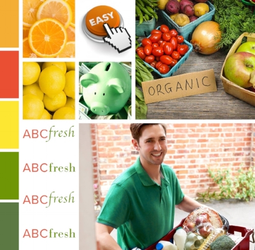
Moodboard
Our style tile further represented our brand attributes. It included the ABCFresh logo, color palette, active and inactive buttons, typography, and photos that represent the intended look and feel. Desirability testing with 5 testers resulted in realizing we were missing the “people aspect” but that our app truly represented our intended brand attributes. We made the necessary adjustments to the style tile before creating the hi fidelity (hi fi) prototype.

Style Tile
We created the hi fi prototype using Sketch, and uploaded it to Invision using the Craft plugin. While creating the prototype, we each contributed various parts of the atomic design which then contributed to our style guide that defined the visual elements of ABC Fresh.

Hi fi prototype screens